This post is part of my portfolio of personal projects resulting from my transition from generalist data science (2013-2025) to geospatial data science, GIS, and GeoAI (2025+).
Bookstores have a lot of printed world atlases, which are nice to look at but have the trade off that each country is shown either once with a tradeoff of physical and political attributes, or in multiple maps that are not overlaid. Online maps often have impressive visualizations of particular places, but rarely cover all of the world’s countries at a consistent level. Using online vector and raster data along with QGIS and PyQGIS enables viewing of each of the world’s 258 countries and regions with a variety of combinations of data. Dask-Leaflet enables these per-country views to be displayed in a webapp in the browser.
The top-level approach taken to achieve this desired view of all 258 countries and regions is to overlay-and-clip:
- Select a vector map containing country/region borders
- Overlay desired raster and vector data
- Clip to the desired country/region
This can be done in the QGIS GUI to find suitable datasets, then automated using PyQGIS to run for all 258 countries/regions.
Data
We want to map all the countries, so key requirements for the data are
- Every dataset used covers all countries: no gaps or subsets
- Available as raster or vector usable by QGIS/PyQGIS
- (Also) Open source, not paid
Following these requirements, the project’s current selection of datasets consists of
- Natural Earth: country borders, admin regions/states/provinces, elevations, populated places, roads, railroads, urban areas, rivers, lakes
- Population density: Landscan Global 2023
- Land use: Daylight Map land cover
- Climate zones: GloH2O Köppen-Geiger
The idea is that, for the displayed country, these data layers can be overlaid in various combinations to gain interesting learning, insights, or exploration of that country, and that the same can be done for every country. An example would be population density overlaid on natural features + climate zones.
Any single map will be a simplification of the full story of a country, but the available insight from that map is always multiplied by 258.
Automate
Once the datasets are assembled, loading the layers, clipping to the desired country, and giving the layers the desired properties is fairly straightforward in the QGIS GUI without writing code. However, to do this for all 258 countries/regions requires automation.
QGIS is built upon GDAL, so the GDAL command line interface commands like gdalwarp could be used for some of the processing such as clipping to countries. However, the Python integration PyQGIS is more convenient end-to-end. We therefore use this within a Python virtual environment in the VS Code IDE, and the QGIS Python console.
Using an IDE in this way opens up AI-assistance in writing the code, which is beneficial. While most code generated by the AI had to be modified manually to work correctly, it noticeably sped its creation. The AI was particularly good at providing the syntax and classes from QGIS’s large selection to correctly set raster and vector layer properties.
(QGIS can also provide the Python equivalent to a command executed in the GUI, another valid approach.)
Getting it to work
Of course, this is GIS using real data, so it won’t “just work” out of the box 😀 . There are various issues and details with the datasets that need to be overcome to obtain a useful result. Other issues encountered are suitable for future work and improving the results further.
The most significant issues found and resolved are
- Invalid geometries: Artifacts like self-intersecting polygons in country borders render a vector layer invalid. It may be surprising that the supplied data has this with a dataset as general as country borders, but setting the QGIS property Invalid features filtering to Do not filter resolves the problem. Better would be to make the geometries valid using an algorithm like QGIS’s fix geometries or PostGIS’s ST_MakeValid, but it was not needed at the project’s current level of development.
- Country shapes: The QGIS default coordinate reference system (CRS) EPSG:4326 is good for showing the whole world. (Equal Earth 8857 would also be good.) However, countries far from the equator have their shapes distorted, and since we want to view countries individually, their shapes should be correct while their relative sizes do not matter. This makes the Mercator projection EPSG:3857 appropriate.
- NoneType objects: This usually occurs when trying to set a property on a layer that has no pixels due to the country being very small. Checking the raster is valid removes this.
The most significant issues found and not yet resolved are
- Small countries are low resolution: with a globe-spanning dataset of fixed pixel size such as Natural Earth, small countries are pixellated, which limits the usefulness of their views. Currently we have categorized them into ok = works well, can see pixels = works well but can see some pixellation, and small, meaning to few pixels to be useful. 112 countries are ok, 61 are can-see-pixels, and 79 are small.
- 6 countries still fail outright: Antarctica (unsurprisingly), Côte d’Ivoire (character encoding), and 4 more with a list index out of range. Antarctica can likely be handled as a special case using a suitable CRS that covers 90° south latitude. The others just need more error or special case handling in the code.
- Some countries have areas separated by sea distances much larger than the sizes of their land areas, for example some Pacific island nations, and France (French Guyana). Generally these areas will fall under different regions in the admin/regions dataset and so could be separated and viewed that way. Similarly countries that span 180° latitude that have a too-far-out default zoom could be better projected.
Webapp
Making the country visualizations viewable is key to the results being useful. There are a number of options, including
- Have the user run QGIS itself (instructions or plugin)
- QGIS Web Client
- Dash-Leaflet in the browser
- Others: Folium, ipyleaflet, Leafmap, Google Earth Engine
We chose Dash-Leaflet, because it provides straightforward overlaying of raster and vector data, appearance customization, and on/off layer switches, the main items needed for this visualization. It does so directly in the browser via localhost or a shareable URL. QGIS itself also works, as a byproduct of writing the code. The others were not attempted.
Aside from setting up the webpage and the various elements, the main other webapp code in Dash-Leaflet is using Javascript functions to set the layer properties. This was another area where the IDE AI assistance considerably sped the work, writing the functions largely correctly from descriptions of the desired properties.

Interesting countries and views
As hoped for, the country visualizations provide some interesting views and insights. The screenshots in this section are taken from the QGIS interface.
For reference, the Köppen-Geiger colors and climate zones are


Uzbekistan
Here we overlay the population of Uzbekistan on the terrain (monochrome to avoid color mixing) with road + rail infrastructure, alongside the Köppen-Geiger climate zones. We see that the west of the country is barren (climate type BWk dry arid cold), flatter, and mostly depopulated, while the east has more people. But why is there population in some parts of the dry areas?


Right: Koppen-Geiger climate zones
If we show the land cover layer, a possible answer is cropland.

And indeed, if we add population back over the map, we see that it tracks the cropland areas almost exactly:

Other countries showing this population-follows-land-use pattern include Tanzania, and ones that partially extend into a desert such as Niger, Tunisia, and Yemen.


Indonesia
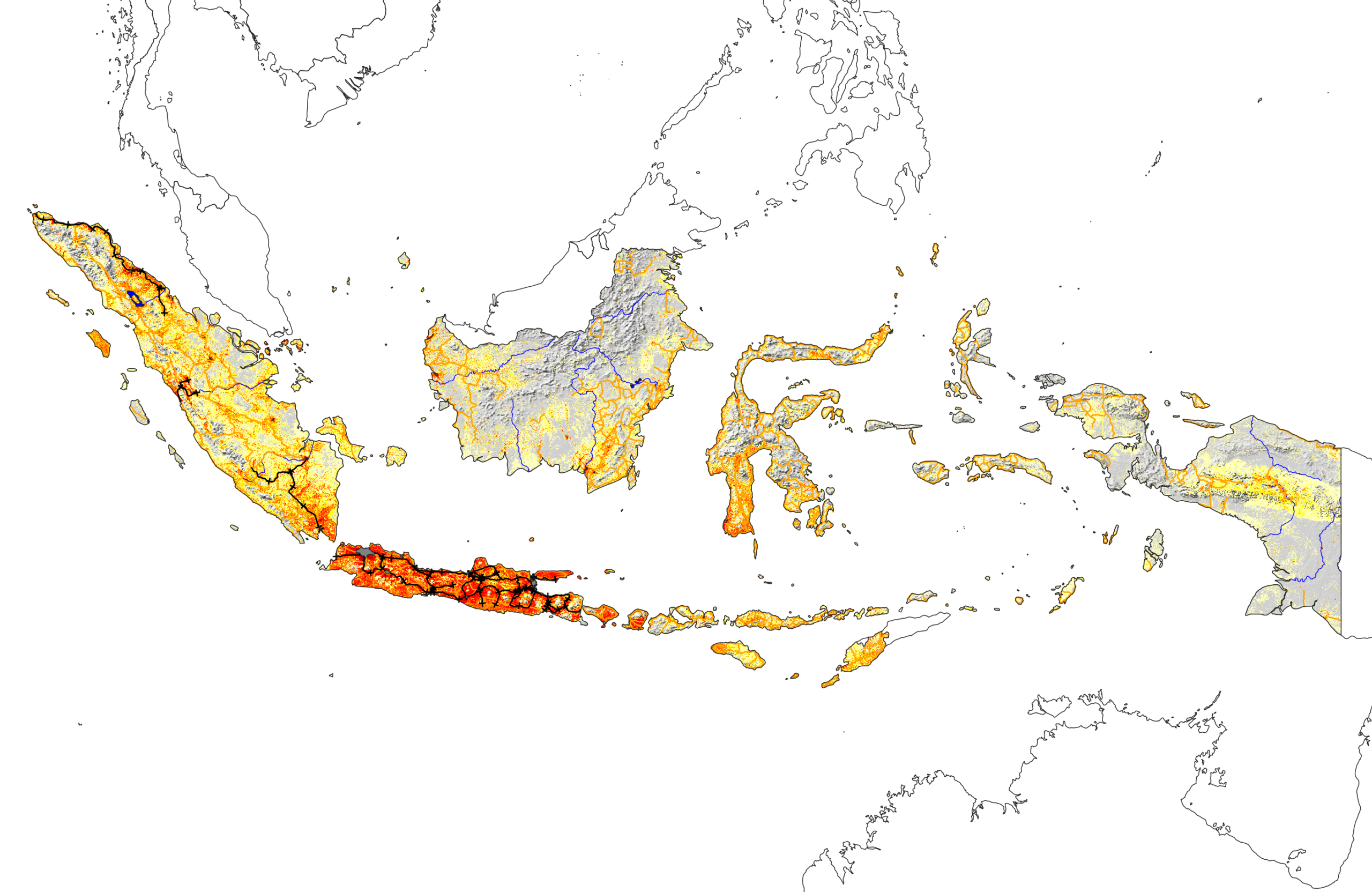
This is an example where broad patterns within the country are immediately apparent.

While there are many islands spread over a large area, the island of Java is clearly dominant in terms of both population and infrastructure. Next is Sumatra to the west of Java, followed by Sulawesi to the northeast. Only Java and Sumatra show railroads, and large parts of Borneo and Papua are sparsely inhabited.
Nigeria
Some countries are well known to have large populations, such as China and India. But there are others that have a great deal of people that not everyone is aware of. A good example of this is Nigeria. By far the most populous country in Africa, the extent of people is seen immediately when the population layer is activated:

A possible reason, broad areas of crops, trees, and grass across the whole country, is also clear to see:

Pakistan is another example of a highly populous country whose map shows it:

Indonesia is too, although in its case it is less obvious because of the large area of the country compared to the population centers. The United States is similar in that regard.
Oman
Finally for population, some countries have almost all people living only in very specific areas. Often these are inhabitants following rivers or being by the coast. Oman is a striking example:

Others where the people follow the rivers, the topography, or some other pattern in all or part of the country, are readily found, such as Syria (in the east), and Taiwan.


Peru
Moving on from population, some countries have wide ranges of topography, land use, and climate. By spanning the arid coast, through the Andes mountains and into the Amazon rainforest, Peru is one of the best examples, visible if we view the topography and climate zones:


There are plenty of others showing variety that may be less well-known, such as the more subtle but still-there regions of Italy, or the colder north of Japan.


South Africa
Finally, let’s view one more country that well exemplifies the overview seen by accessing a range of data: South Africa.


The topography shows that most of the country is highlands, with lower-lying coasts. But the landscape and climate vary widely, being more barren in the northwest and temperate in the east. The population largely follows this, with the main cities being Pretoria (and Johannesburg), Durban, and Cape Town.
More
This page highlights a small fraction of what can be found by exploring these datasets. All the stories and insights seen here can be deepened by further research on a given country. The point of course is to give the level of overview seen for every country, in one place: multiply every layer combination shown above by 258.
Summary and Future Work
We have created a process that visualizes each of the world’s 258 countries and regions and allows interesting information to be overlaid. The process of gathering raster and vector layers and clipping them to the desired country is generic and extensible to other data. The results are viewable in QGIS or in a webapp. The processing is done in QGIS/PyQGIS, and the webapp is in Dash-Leaflet.
While better views may exist for given countries, the key driver here is to get them all in one place, with all layers always available, so the user can explore and learn without bias towards parts of the world that are covered by greater amounts of geospatial data, projects, or companies.
There are a number of obvious ways this work can be improved further
- Webapp legend
- Higher resolution data for smaller countries, especially the borders and digital elevation models (DEM)
- Cloud-native workflow to tile and serve such larger data at an appropriate resolution for the chosen country being viewed, using formats like cloud-optimized GeoTIFF (COG)
- Other datasets, e.g., Satellite Embedding V1 from DeepMind’s AlphaEarth Foundations GeoAI model
- Other information such as industries, geology, mark the capital city, some photos, major attractions, etc.
- Country-specific CRSs: some countries such as Canada are still distorted in Mercator projection (Ellesmere Island is not that big), and might benefit from a more “looking down at the globe” view, or a country-specific CRS
- Enable printer-friendly or PDF views for each country
- Enhance the webapp with pictures, text, etc.
- Project as a QGIS plugin
- Combine DEM data and QGIS 3D for a 3D view of each country
In addition to these, there a range of smaller or technical details in the code, data, and presentation presented in the project’s GitHub repository.
Image Credits
The images in this blogpost show Natural Earth data overlain with some or all of Landscan Global 2023, Daylight Map land cover, and GloH2O Köppen-Geiger.
Note: I have added some of the improvements mentioned above to the GitHub repository since this post was written, along with some others as well. The improvements do not outdate the text here.